Amazon Fresh is Just Okay
I recently convinced my wife to give Amazon Fresh a try. I work a lot, so the idea of trimming down the 4-5 hours a week we spend grocery shopping seems like a no-brainer.
All-in-all, I'm pretty happy with the service. Shopping in your underwear and having it all magically appear at your doorstep the next day is pretty great. It's a good bit more expensive then going to the store yourself, with a $7 delivery fee, tip for the driver, and, I figure, about a 20% price premium.
Trip to Supermarket = 1.5 hours and costs $50
Trip to Amazon Fresh = 0.5 hours and costs $70
$20 to save an hour is pretty expensive, but add-in dealing with Sunday shopping crowds, parking, hauling bags, etc.; and you can just about justify it.
The shopping experience itself however, was less than stellar. Which surprised me coming from the worlds biggest online retailer.
It was curiously frustrating. Nothing that was glaringly obvious at first, just an impression after you've finished filling your cart that, "Phew! I'm glad that's over with..." I decided to take a deeper look and break it down into how I'd do it differently.
1. Give Users a Sense of Scale
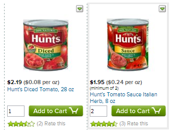
Big or Small?
People depend on the size of things to identify objects, judge value and differentiate between similar products.
I've often bought something online to discover once the package arrived that I'd terribly misjudged its size. I have a mouse pad that covers a quarter of my desk (which it turns out, is brilliant). Another time I bought a cashmere blanket as a gift for my wife that turned out to be about the size of a handkerchief (less brilliant).
All of the images in the Fresh catalog are scaled to be the same size in pixels, sacrificing our ability to judge things as you would intuitively do with physical objects. This forces you to resort to comparing numeric descriptions with your past experience. Is 15.5 oz a lot of cereal, or a just a little?
It would take some legwork with a lightbox and a camera, but wouldn't it be nifty if the product images were proportional to their actual size? Even better, if the product tiles were scaled as well, so that smaller items wouldn't waste a lot of space.
2. Be Hyper-Organized

Odd couple?
I used to stock groceries at a small grocery store and organizing products on shelves is much harder than it looks. Products come in lots odd shapes/sizes and there's no stock-boy handbook with a master hierarchy of groceries.
If you get it wrong, say, by putting the chili next to vegetables because they're both in similar size cans and the same brand, your boss makes you do it over again. Why? Because customers who can't find things get frustrated and shop elsewhere.
The problem with Fresh is that the default organization of items is by "Relevance". What the heck is "Relevence" when you're shopping for cucumbers? I feel certain it's something to do with purchase frequency, but in this instance, my purchase decision has nothing to do with how often a thing is purchased.
It might be better if they just sorted everything by hand. It seems daunting at first, but I've been there. You can do a small grocery store in an afternoon, and that's with the backbreaking chore of moving dozens of each item by hand.
3. Wasted Space = Wasted Time
A defining time in many designers' lives in when they finally understand the beauty and power of whitespace. It's magical that just the right amount of nothing at all can elevate a sloppy mess into an elegant collection.
But then again, sometimes functionality is more important than beauty. Shopping for groceries is one of those times.
A grocery trip is an exercise in making millions of comparative decisions. A person must identify thousands of products as they walk the aisles, making judgments about taste, quality, quantity, healthiness, and cost. They do this while forecasting their future needs, trying to remember whether they already have something and deciding what to have for dinner next Wednesday.
And most don't do it for fun, the way a person might shop for clothes or electronics. They do it out of necessity, a weekly chore.
On a 1600x900 laptop screen using Chrome, I can see 7 products fully without scrolling on their core product listing pages.
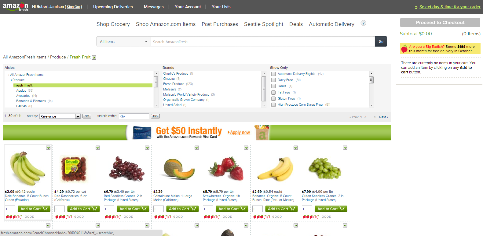
The space above the products is used horribly:
- two distinct nav bars,
- a large search bar on its own line,
- a full page width breadcrumb
- an always expanded 3 category tree filter/brand filter/product attribute filter
- a paging bar with yet another filter and another search box
- a full page width space for an ad
That's about 460 pixels of rarely used cruft getting in the way of my important San Pellegrino vs. Orangina decision-making.
4. Mental Models

The home page
If people had thought bubbles (and man wouldn't it be great if customers had thought bubbles), the air above the aisles in a store would be full of little maps of the store with a personal dotted line snaking through the store with way-points marking the areas they expect to find the items they need.

The root category page
This is an oft overlooked aspect of UX design. Good sites give their users tidy maps they can carry around in their heads so that people can think several steps ahead, and over time, explicit actions can become automatic ones. This is why people complain about Facebook design changes, they've messed with their users' mental model. Occasionally it's worth the trouble.

The one-off "Produce" category landing page
Fresh commits the sin of forcing the user through three to four different layouts when going from the home-page to the main product pages.

The sub-category page
- The home page has a large "hero" tile surrounded by a few ancillary promotional tiles. Users click on the, slightly obscure, "Shop Grocery" link on the upper left to get in.
- The next stop is a list of top-level grocery categories on the left with a few pretty tiles occupying most of the page. Okay, hard right turn, but I can dig it...
- If you click "Produce", but not on any of the other categories, you get an odd interstitial page with the produce sub-categories now interspersed throughout the page. Huh?
- Next click and you're finally to the core of the site. The place where you buy stuff. But now the categories are shown in a tree, and inside a sub-window with its own scroll bar. Am I on the same site?
Any one of these might make a perfectly adequate mental model, but taken together, they are bewildering. To make it worse, most of the important landmarks you'll depend on to navigate are grey text, while the memorable images are all promotional things that will no doubt rotate the next time you visit.
They should drop at least two of the page layouts. "Consistent but ugly" will keep more users than "random but cute".
5. Users and Applications Are Symbiotic

Another trick of UX design is that interesting functionality can emerge without your exactly designing for it if you just give the user some flexibility.
A good example is a butter knife. Great at spreading things on toast. But it's also a sturdy piece of metal with a thin edge, so can serve as a screwdriver in a pinch or for poking at things that fall into the space under your fridge.
A web app is no different, and you can make up for some of the constraints of screen space by using the customer's memory. For example, instead of maintaining a big list of diverse things, as in Fresh's shopping cart, let the customer figure out how they want to organize things.
Imagine a cart that is just an empty box that you can drag and drop items onto. The user is free to organize them however they wish. The icons can be tiny and you can leave off the names/prices, because the user remembers selecting it and where they put it. Just like a physical shopping cart at a store.
Some users might organize items into "might want to buy" and "definitely buy" categories. Others might pile up the stuff they need for a particular recipe in one corner. My use case would have been putting "stuff for the party" in one pile and my staple purchases in another.
While we're at it, a simple text box with auto-save would make a nice shopping list as well. No fancy check-boxes or hierarchy needed, I'll figure that out myself, thank you.